TL;DR
Honestly? The screenshot is Coedit's biggest competitor, and it wins plenty of rounds fairly: nothing beats a picture for "does this direction feel right?" in a Slack thread. It loses the moment the answer matters: a screenshot amputates the interactivity, forks the feedback into chat, and freezes one state of a thing whose whole point is that it responds. The dividing line is one question: do you want a reaction, or a review?
The case for the screenshot
Credit where due. The screenshot is instant: two keys, paste, sent. It's universal: renders in every chat app, every inbox, every phone, no account, no link warning, no "it won't open" reply (the file has that problem; a PNG doesn't). It's frozen, which is sometimes exactly right: what you saw is provably what they saw. For a gut-check on visual direction from one person, the screenshot is correct and everything else is ceremony.
If that's your case, close this tab with our blessing.
Where the picture starts lying
An AI app is an artifact, not a document: its value is that it responds. The screenshot deletes precisely that:
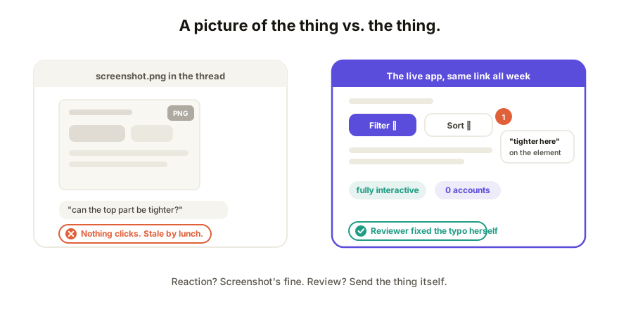
- Nobody can try it. The filters, the calculator, the hover states, the second step of the form: all gone. Your reviewer approves a poster of the app, and real problems (the dropdown that lags, the chart that breaks on filter) sail through unseen. You find yourself sending four screenshots to cover one page's states; the page is telling you it wanted to be a link.
- Feedback forks away from the work. Reactions land in the chat next to the image ("can the top part be tighter?"), disconnected from the element they mean, the describing-vs-pointing problem in its purest form. Nothing anchors, nothing accumulates, nothing resolves.
- It's stale on arrival. You'll iterate an hour later; the screenshot won't. Yesterday's PNG circulates as the current state of a thing that's had six versions since, and there's no history, so nobody can even say which version the thumbs-up applied to.
- The reviewer stays passive. The person who spotted the typo can't fix the typo on a picture. Every observation becomes your task.
The comparison, honestly scored
| Screenshot | Coedit link | |
|---|---|---|
| Time to share | Seconds | A paste, then seconds forever after |
| Opens for anyone | Yes | Yes, no account to view or comment |
| Recipient can use the app | No | Yes, fully interactive |
| Feedback lands on the work | No, in chat | Yes, pinned to the element |
| Reviewer can fix small things | No | Yes, no-code edits if allowed |
| Stays current as you iterate | No | Yes, same link, history behind it |
| Works as a quick visual gut-check | Perfectly | Fine, but overkill |
Rule of thumb: reaction → screenshot; review → link. A reaction is one person, one glance, one "yep." A review is anyone needing to click, comment, decide, or change something, and every screenshot round there costs you a translation lap through chat.
The quiet middle ground
This isn't either/or forever. Plenty of teams screenshot from the live link: the PNG goes in Slack for attention, the link goes with it for the review. The picture gets the glance; the link catches everything the glance provokes. That combination costs nothing and ends the "wait, which version is this?" thread permanently.
How Coedit fits
Coedit is what the screenshot can't be: the app itself, at one live URL, still interactive, with comments that pin to elements, edits without code, and a version history that remembers what every reviewer saw. Paste the HTML from any AI tool once; from then on, sharing the current version is as fast as sharing a picture of the old one. We built it because we kept watching good apps get judged as JPEGs; but for pure "does this vibe?", we screenshot too.
FAQ
Q: When is a screenshot of an AI app good enough? A: When you want a fast visual reaction from one or two people and nothing needs testing: direction checks, "which color?", progress updates. Frozen and universal is exactly right for that.
Q: Why is a live link better for feedback than a screenshot? A: Because the feedback lands on the working thing: reviewers try the actual interactions, comments pin to the element they mean, and the link stays current as you fix things, so nobody reviews a stale state.
Q: Isn't sending a link riskier than an image? A: A public URL can travel, yes. That's what access controls are for: view-only links, invite-only sharing on paid plans, and no-account viewing so the friction stays lower than the screenshot's. An image, once sent, has no access control at all.
Q: Can I do both? A: The best pattern: screenshot for the glance, link for the review. Post the image in chat with the live URL under it; attention and substance each get their channel.